I have always had issues with displaying youtube embeds properly on different devices. Unless I configure media queries meticulously, it used to show black bars at the top and bottom, used to have weird height on smartphones, and so many other issues.
It is a good thing that Youtube follows 16:9 ratio for horizontal videos and the reverse for vertical videos.
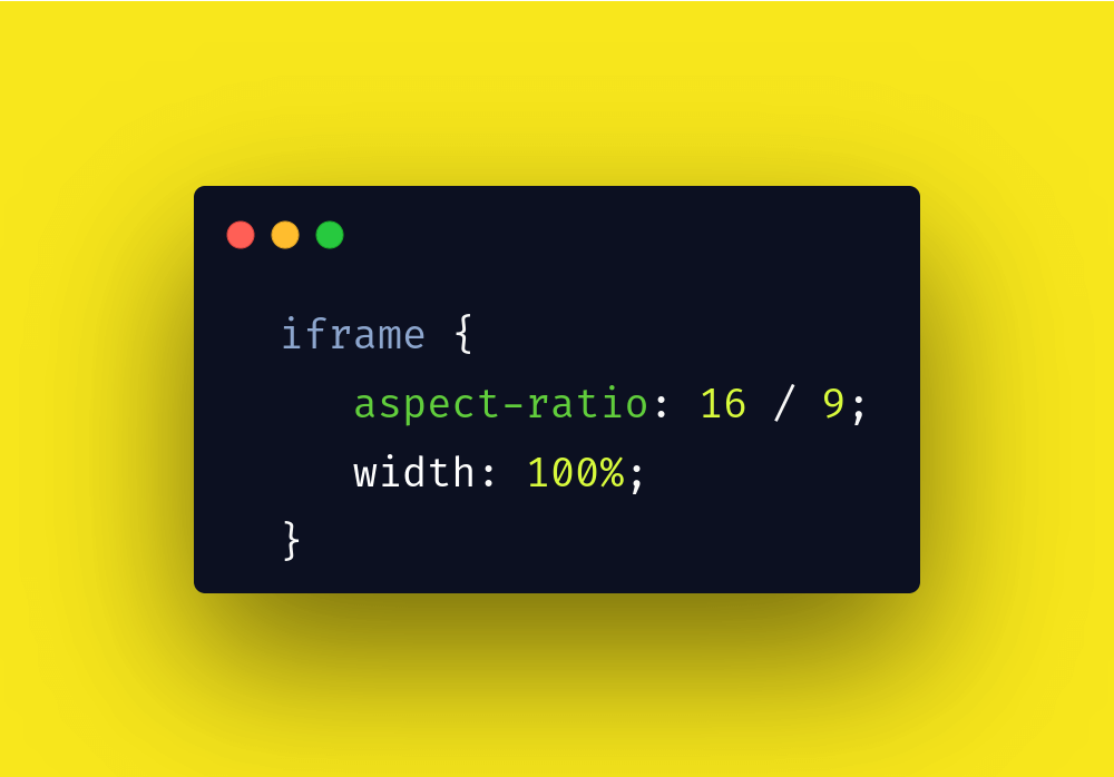
The below CSS will make your video embeds responsive on desktops, phones, ipads or whichever device you watch it on.
iframe {
  aspect-ratio: 16/9;
  width: 100%;
}
Now if you’d like to target only youtube embeds not other iframes then you can specify it like this.
iframe[src*="youtube.com"] {
  aspect-ratio: 16/9;
  width: 100%;
}
Aspect ratio is supported by most modern browsers.
Here is a sample embed,

Use this YouTube svelte component for your Svelte app.
Lazy load embeds
Since we are discussing styles on embeds(iframes), let me add a point that we can lazy load iframes as well just by adding the same tag we use for lazy loading images.
<iframe src="http://some-url.ext/" loading="lazy"></iframe>